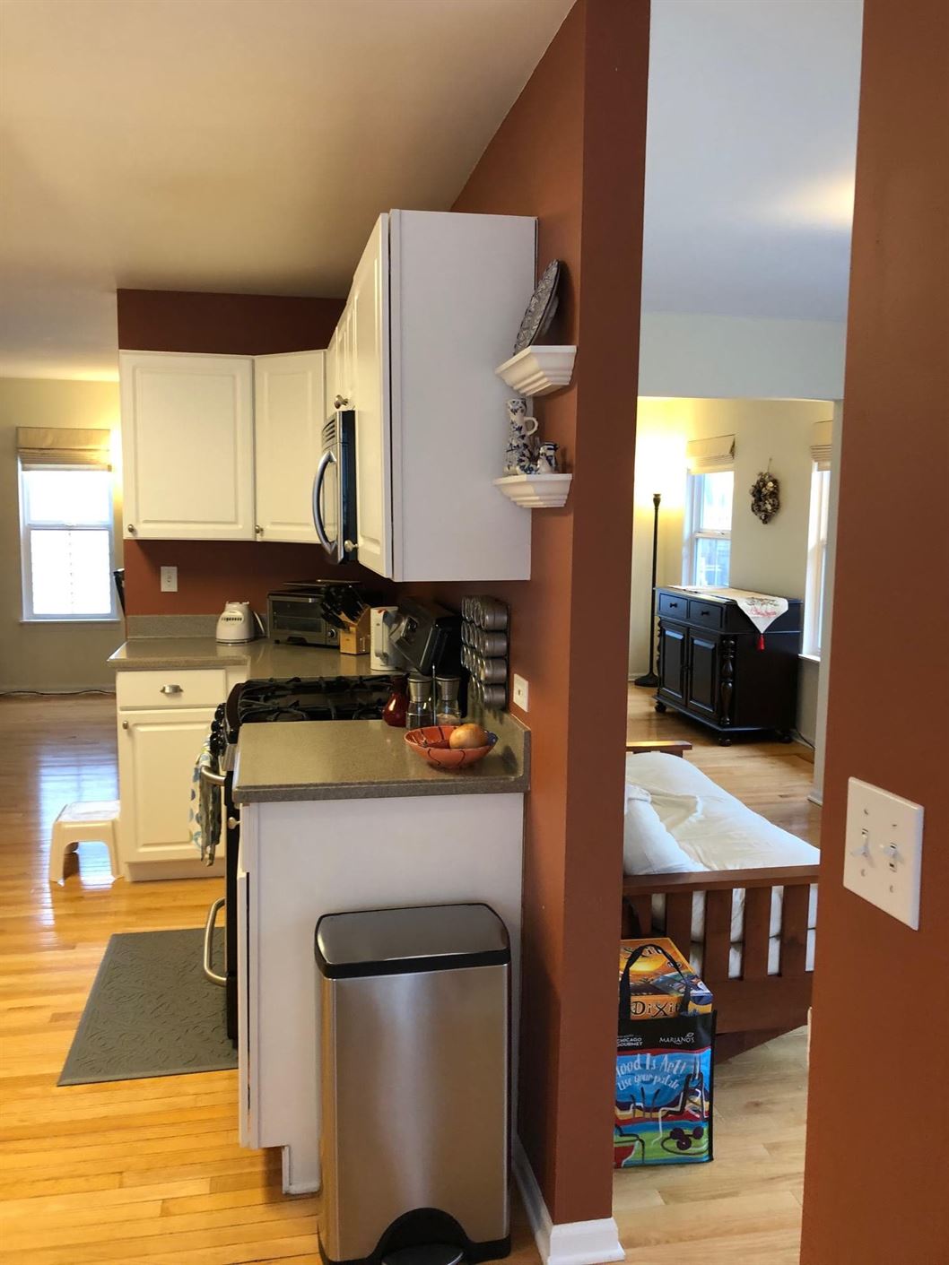
Buying a new home gives you the chance to customize a space to fit your current lifestyle. But what if, over time, your needs change? How do you plan for a remodel to transform your space into a home that truly reflects who you are? This was the problem facing our clients in Downers Grove, who found a home they loved with a kitchen that just wasn’t working for them.
Complete Kitchen Remodel Required
For these Chicagoland homeowners, functionality was the top priority. They needed to remodel the entire kitchen to create more space for cooking, entertaining, and to allow better access to the back deck. So, that’s exactly what LaMantia Kitchen and Bath Designers Jackie Prazak and Annessa Zaharis designed for them.
Creating a Better and Brighter Kitchen
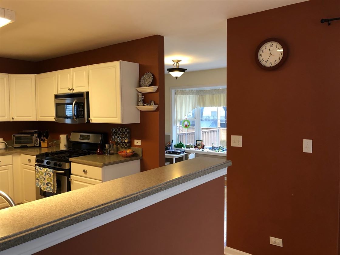
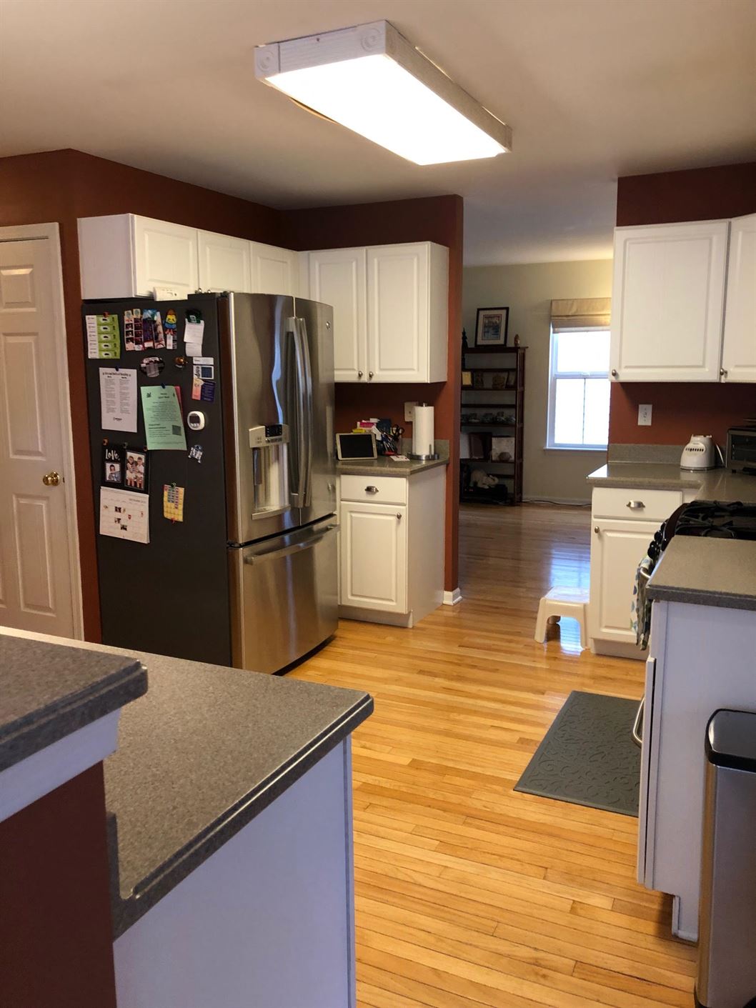
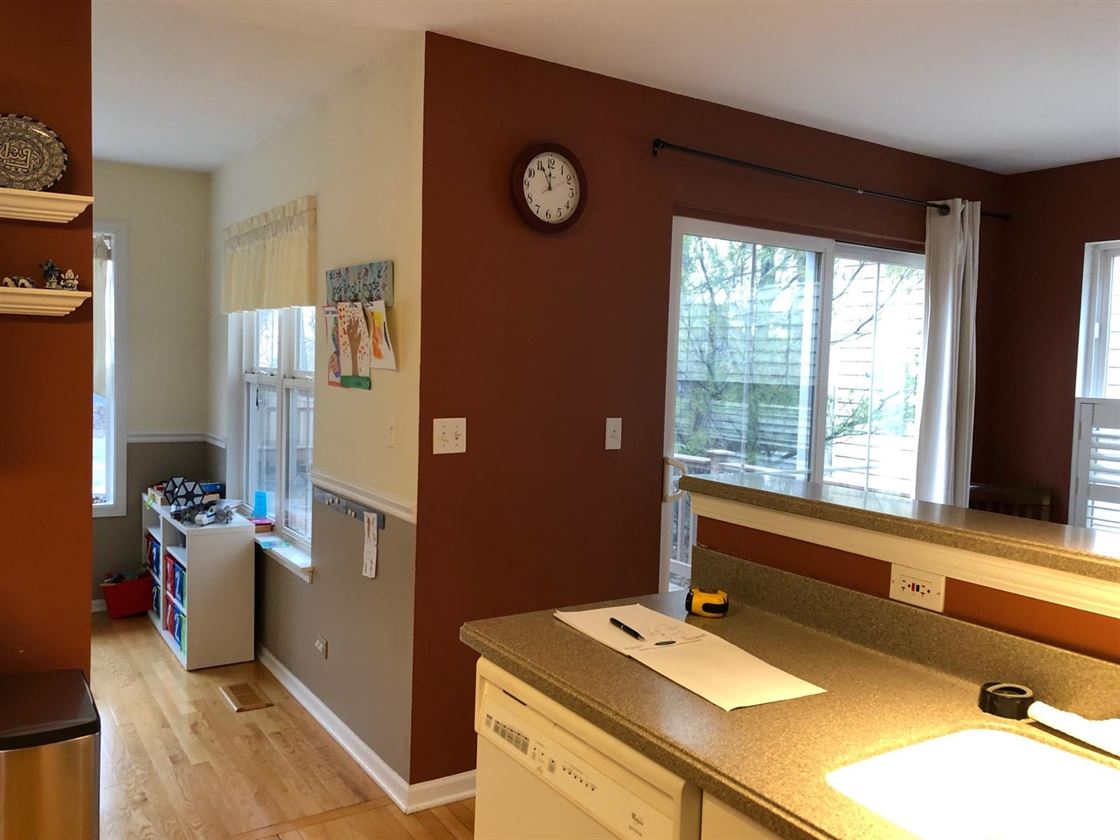
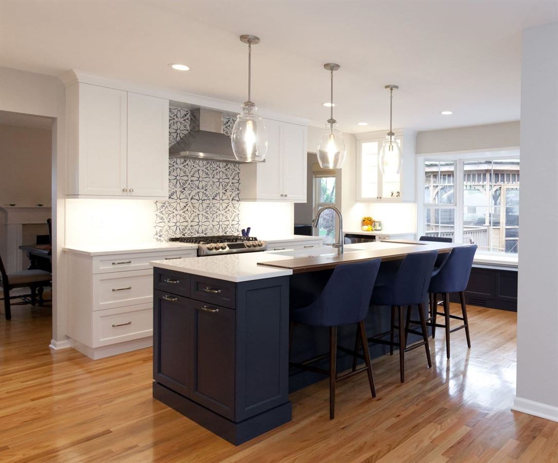
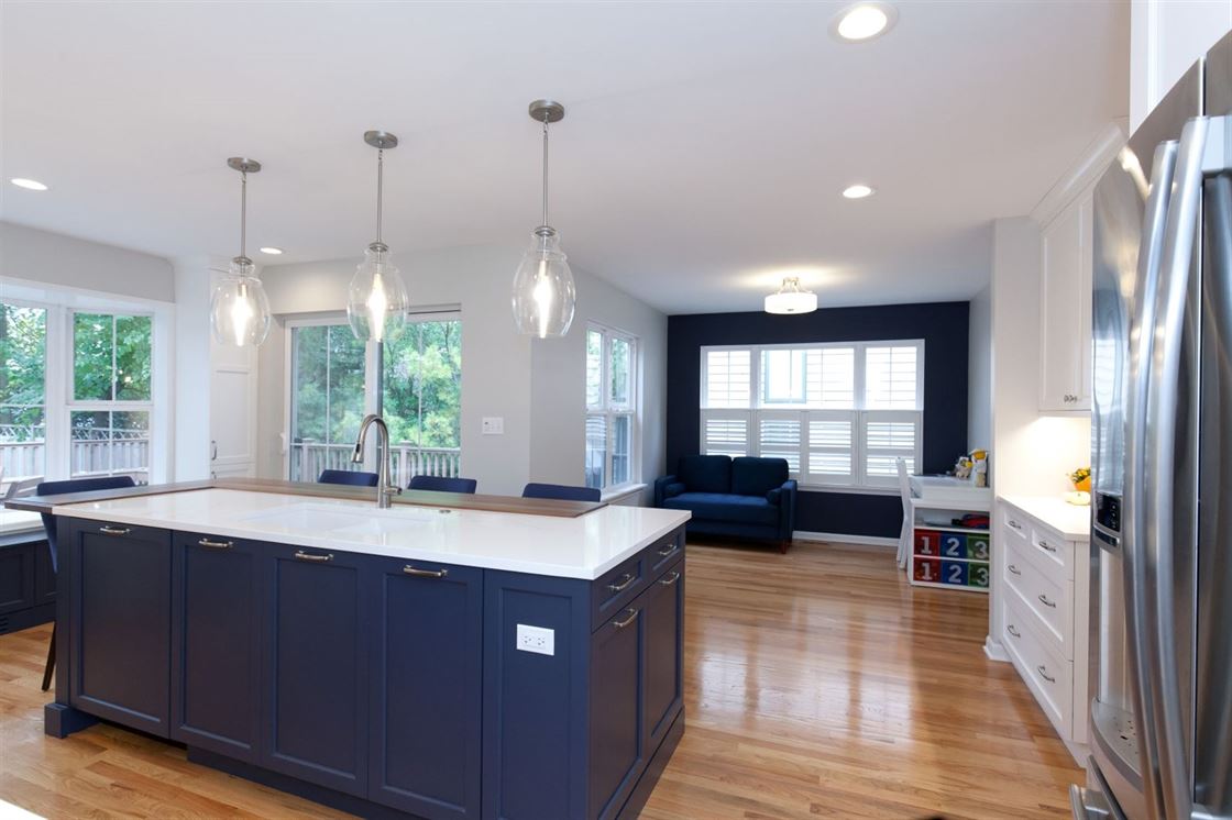
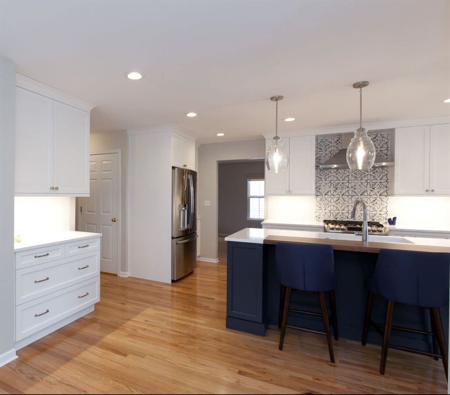
The original layout of the kitchen was dysfunctional due to being located in the center of the house. Because of this, there were four doorways to the kitchen causing the location of appliances to lack flow and function. The dark walls didn’t help the space either. By removing the half wall and full wall between the breakfast nook, kitchen, and dining area the room instantly opened up and created space for a grand island to function as the perfect workspace for the family.
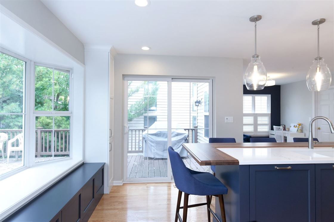
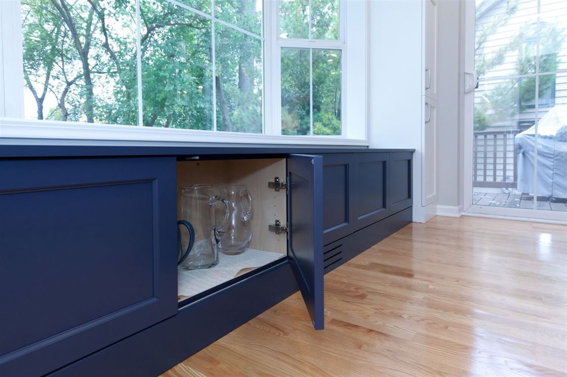
Once the wall was removed, the bay window was repurposed to serve as a seating area, by adding a bench for additional seating while entertaining. The patio door was relocated to provide quicker access to the back deck and grill area, making it easier for the owners to prepare meals and truly enjoy the outdoors.
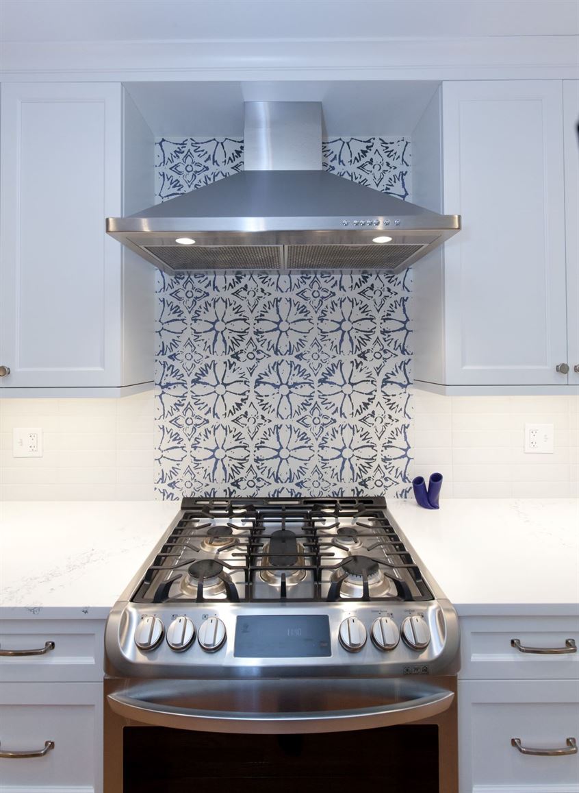
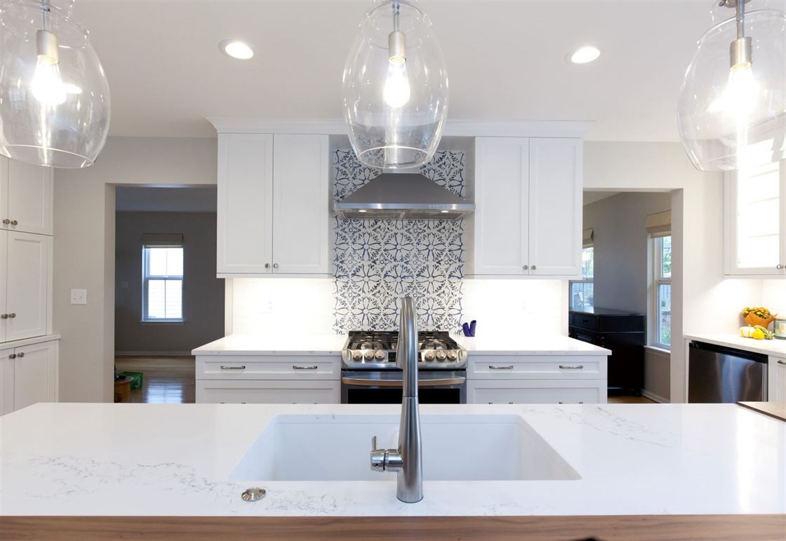
This project also created room for symmetrical cabinetry on either side of the range by closing up the wall between the kitchen and dining room. By doing so, this allowed additional cabinets for storage and moved the sink and range closer together.
Customized Storage and Crisp Finishes
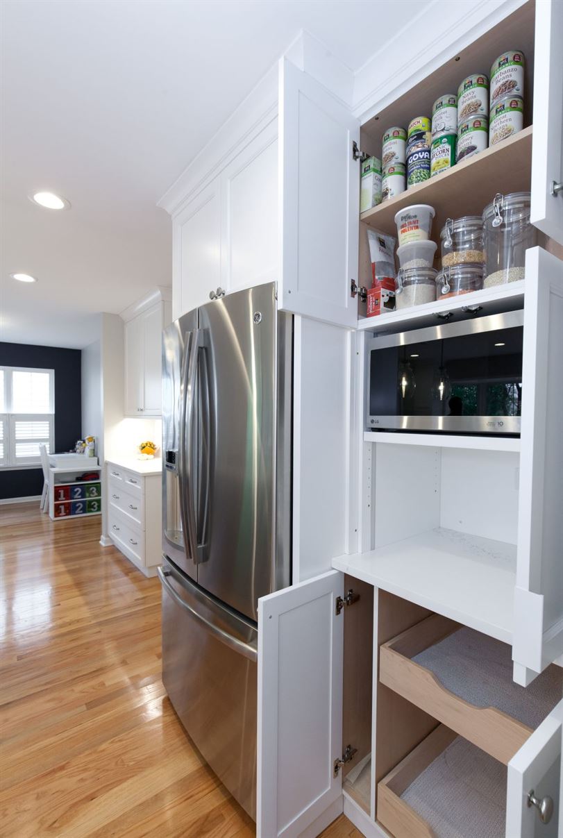
The finishing touches for this project included bright, fun colors and creative storage ideas to provide these homeowners with the kitchen of their dreams. The bay window bench was designed to double as extra storage and the cabinets acted as an unconventional way to hide small appliances.
The homeowners chose a unique way to brighten and add warmth to their navy blue island by combining a walnut wood top and crisp quartz for the countertop. The walnut added a warm tone while the white quartz really enhanced the brightness of the space.
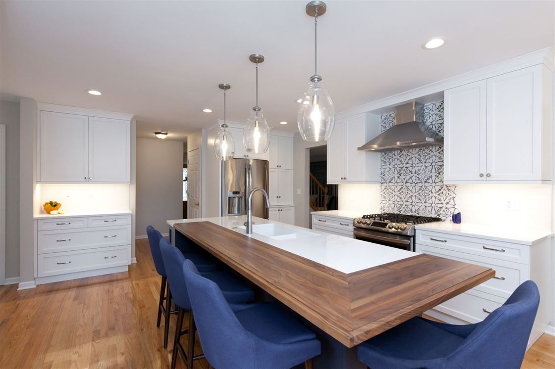
Lastly, the LaMantia design team added a punch of pattern for the client by including a beautiful blue accent in the backsplash above the range. This gorgeous ceramic design from The Tile Shop tied the hues of blue together throughout the room.
